
Business Card Critique
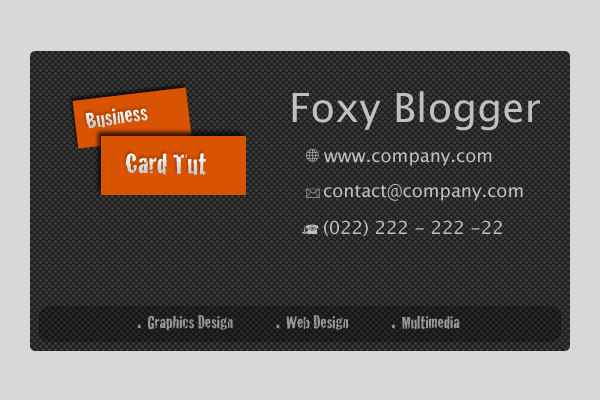
Business Card 1
- The contrast of the orange on black with white text in the orange works well
- The bullet points at the bottom are unnecessary
- The black bar at the bottom shouldn't have transparency because it doesn't contrast well
- The orange card that is above the bottom one shouldn't be crooked
- The name should have been aligned with the contact contents
- There is empty space on the bottom right of the card that can be filled

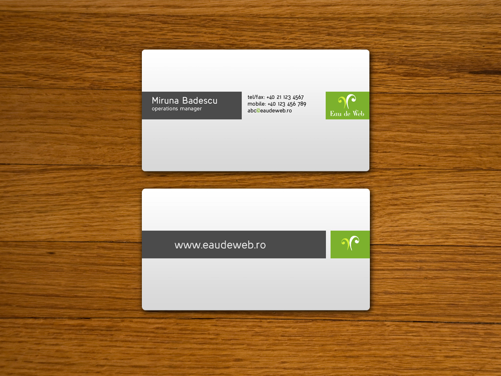
Business Card 2
- The line in the middle contrasts with the rest of the background well
- The line should be straight rather than curved
- The contact information should use the same text as the contact information
- There is space on the top left that can be filled
- The colours and shades contrast really well and have good repetition
Business Card 3
- The title should be aligned with the other information
- The indent seems unnecessary
- The business card was kept very simple and it is easy to tell what it is about
- The font should have been made to be simpler to read for the title
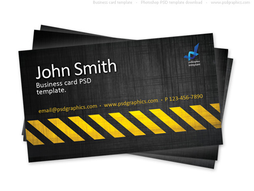
Business Card 4
- There was more space that should have been used
- The website should have been put on the front of the card
- It was easy to find information on what it was about
- Contrast was used very well with all of the colours
- The "@" in the email address shouldn't have been green

Business Card 5
- The contact information should have kept simple
- There should have been less ways to contact the marketers otherwise it looks messy
- The logo should be aligned to the right of the card
- There shouldn't be the "..." in the beginning of the sub heading
- The text should have been bigger
Business Card 6
- The contrast was used very well with the lighting and the background
- The graphic at the bottom is too flashy and it makes the text less noticeable
- The contact information should contrast with the rest of the card
- The card was kept simple other than the graphic and the it is easy to read other than the contact information